Reverb
Making Comparison Effortless on the Reverb Mobile App
Context
As a senior designer on Reverb’s Discovery Experience team, my focus was improving how buyers evaluate and choose between items within search. While Reverb’s mobile app excelled at helping users find gear, it fell short when users needed to compare similar listings—a frequent and high-impact behavior in used gear shopping. This gap represented an opportunity to reduce cognitive load, improve decision confidence, and better align the mobile experience with real user behavior.
The Problem
On the Reverb mobile app, evaluating those differences required users to jump back and forth between item pages, slowing decision-making and increasing cognitive load during a critical stage of the purchase journey.
My Role
I was Senior Product Designer leading comparison UX across iOS and Android. I partnered with Product, Engineering, Analytics, and UX Research to define the opportunity, test concepts, and evaluate impact through experimentation.
What do you use to compare items on the Reverb app?
What details are most relevant to your search?
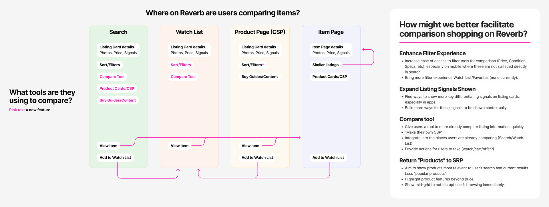
Understanding User Comparison Behavior
From a combination of previous research and analytics, I knew that the search and comparison behavior of our users was very non-linear. Part of this is the natural process of search and discovery, but part of it was due to a fragmented experience where key information was distributed across a number of screens.
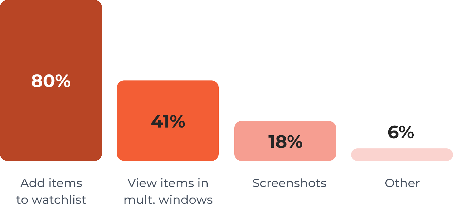
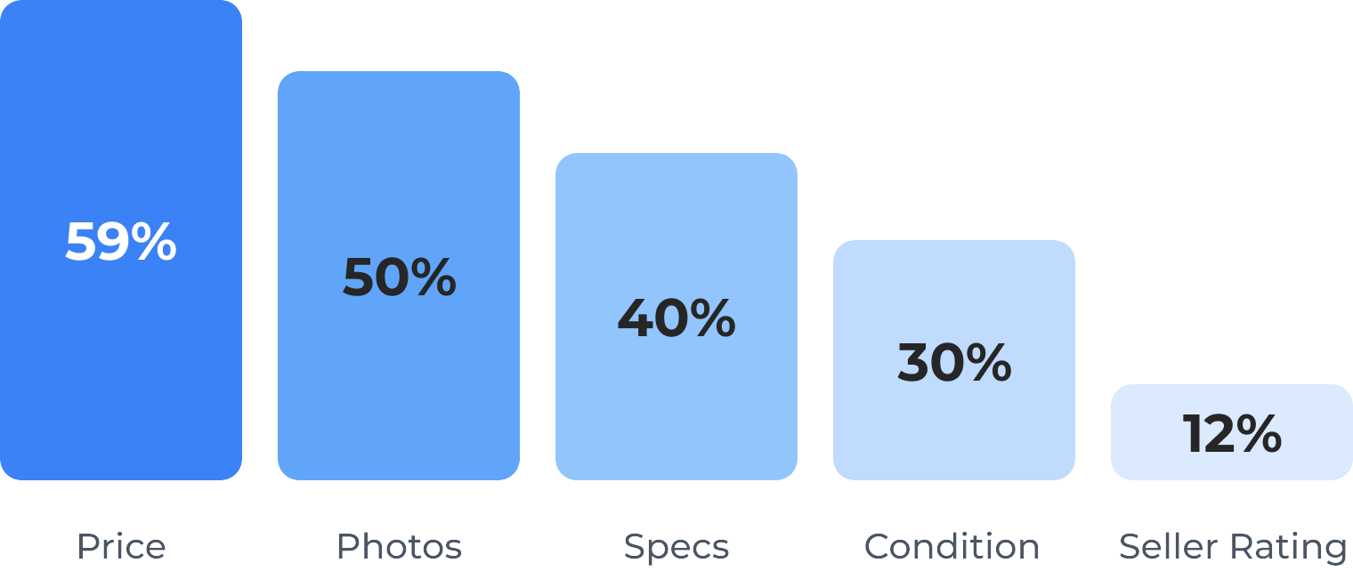
Working with our UXR Researcher, we launched a survey to learn more about how users were comparing items in the Reverb app. We found that price, photos, and product specs were the most important to users when comparing items, especially for used items. We also found that a large number of users were resorting to workarounds like taking screenshots on their phone to more easily compare items.
Comparison is a Holistic Experience
I believe there is no one single solution to improving the comparison process. In addition to tackling core search UX aspects like filtering and item signals, I wanted to give users a way to more easily navigate back and forth between items they were comparing, and landed on a comparison tool as a solution.
Exploring Early Concepts
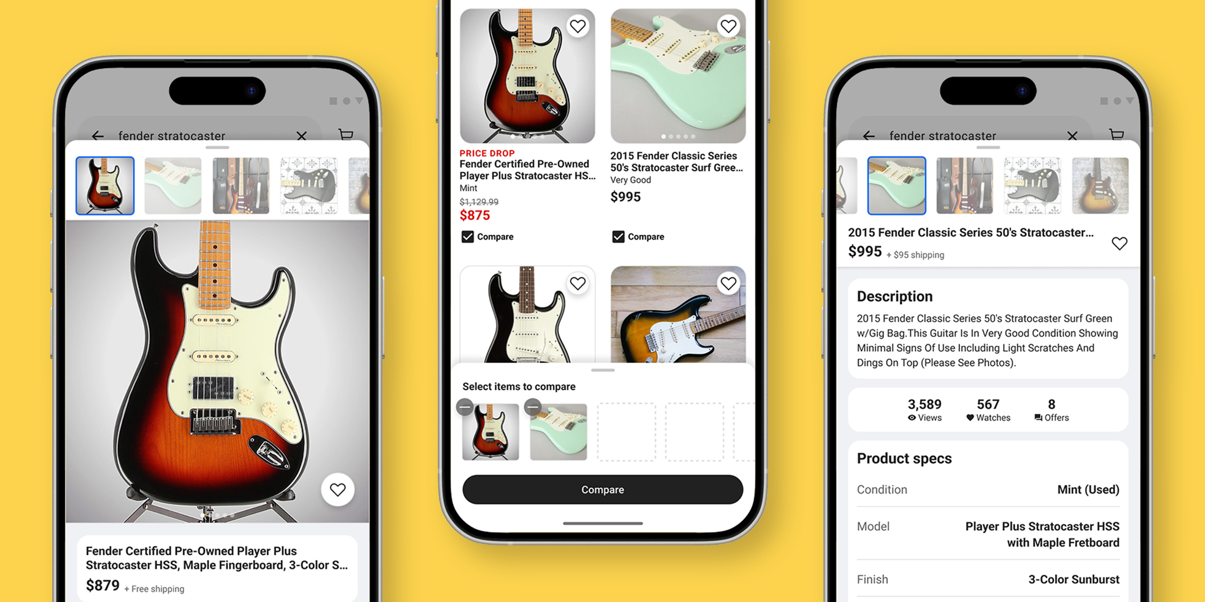
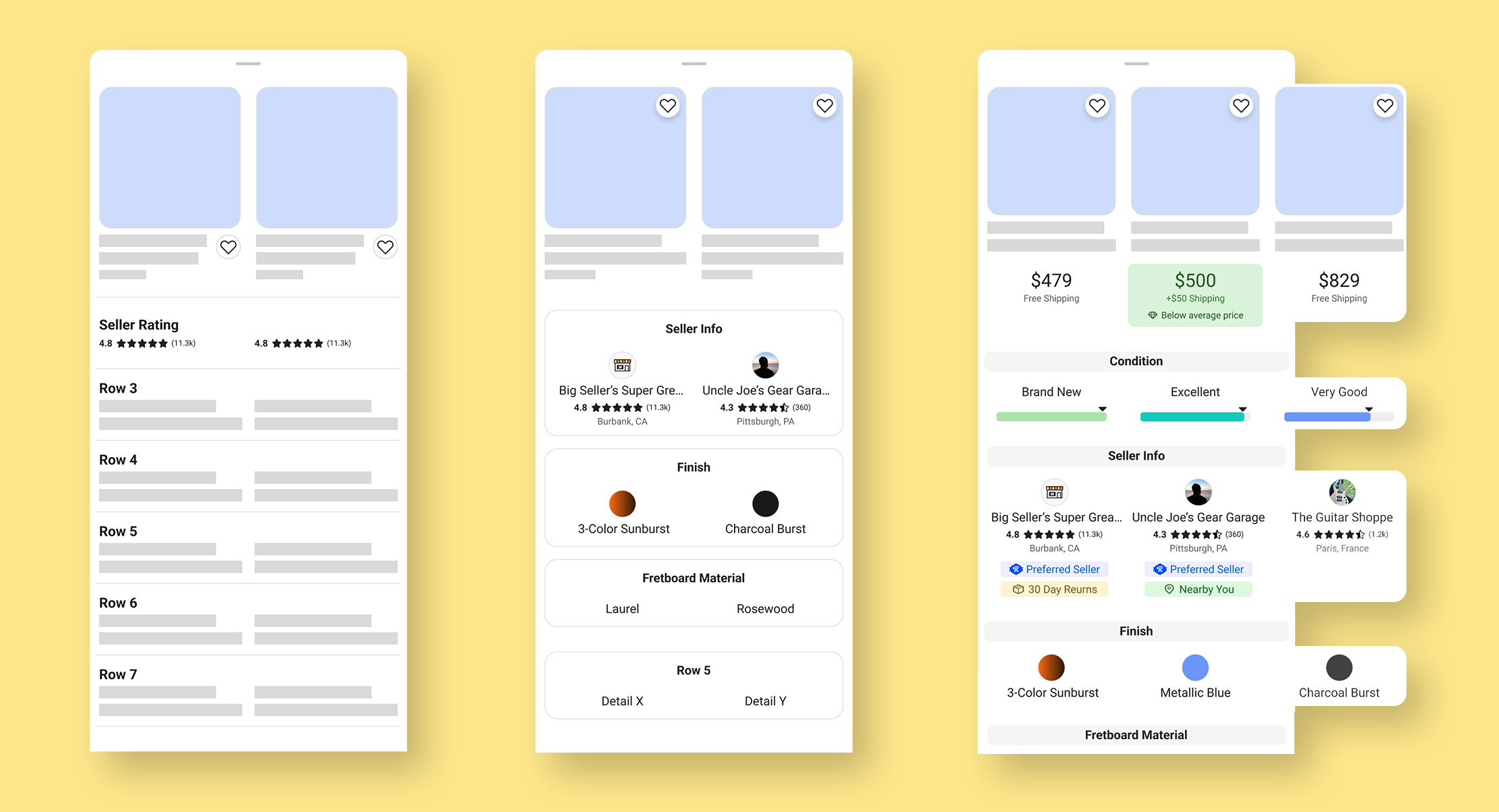
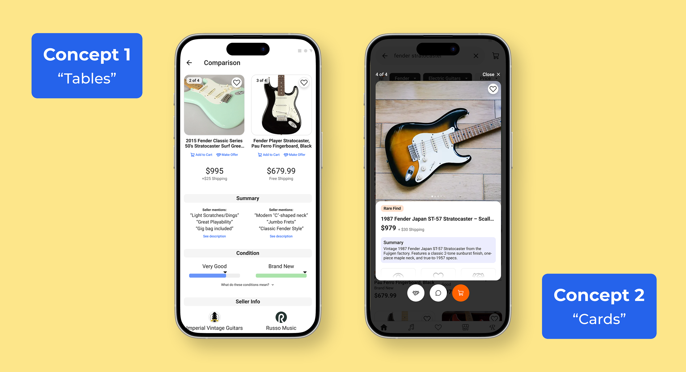
Initially, I explored a table-based approach in line with patterns I’d seen in other comparison tools, but I struggled to make this work for our user’s needs. For one, it wasn’t feeling like a first class mobile experience, with the information-dense tables cluttering views. And while specs are important to users, tables lose a lot of the nuance that differentiates largely similar unique, used listings.
I continued iterating on this table approach but with a focus on mobile usability, and started developing a divergent concept using swipeable cards, with larger photos and more prominent action buttons, drawing inspiration from an unlikely source: dating app experiences.
Getting User Feedback
With Figma prototypes of these two concepts I conducted one-on-one interviews with users to get their feedback. User testing showed a strong preference for the card-based concept, which they said felt more natural and visually focused for mobile, and highlighted more of the details needed to make purchasing decisions., especially photos. Still there was room for improvement.
Designing the End-to-End Comparison Flow
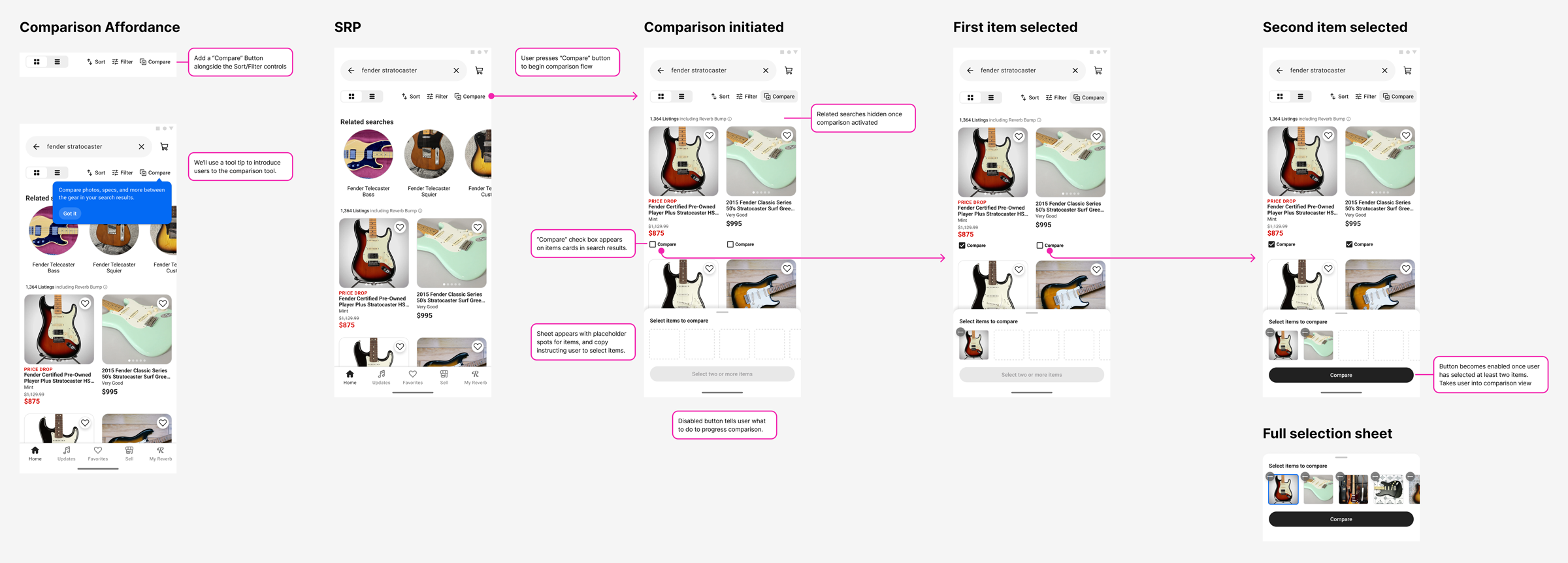
Building out the full comparison flow required close attention to navigation and affordance, making sure interactions were clear without the need for extensive education inside the experience. I paired often with my engineering partners to find solutions for UX edge cases as we discovered them, balancing technical complexity without sacrificing usability.
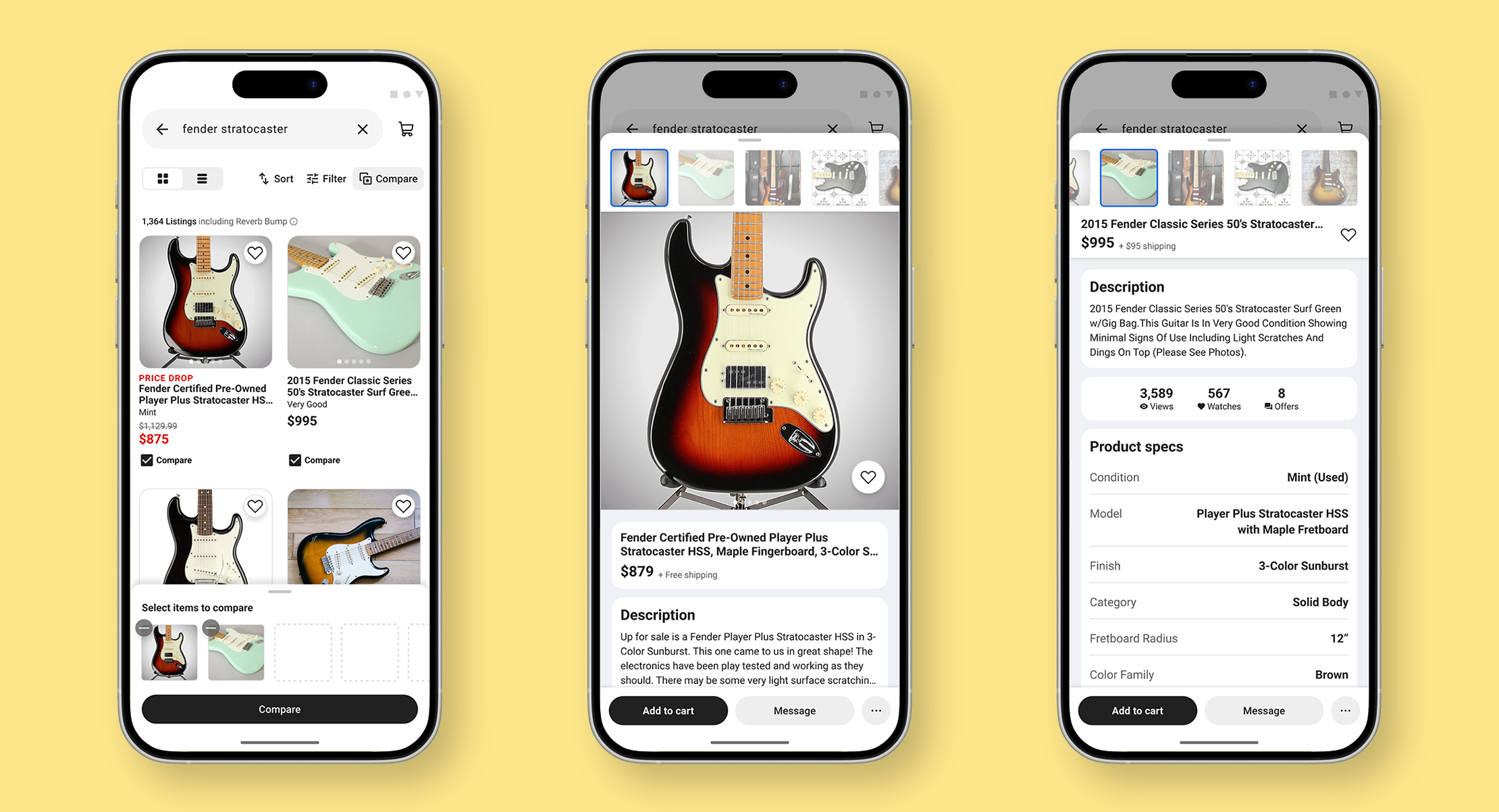
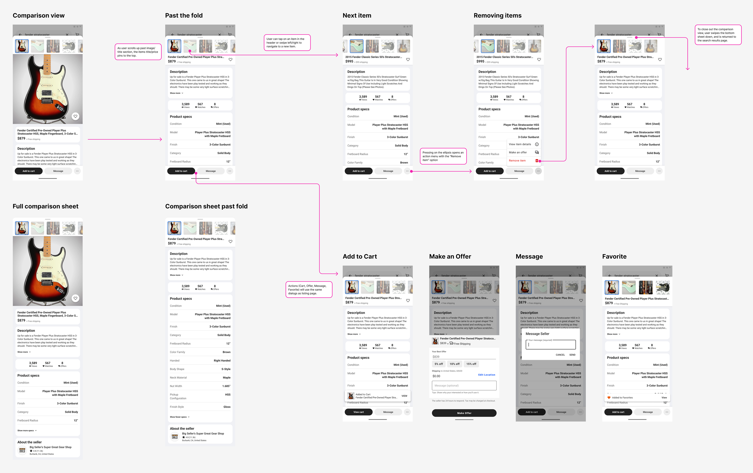
The final result is a mobile-native, full-screen comparison experience with intuitive swipe and tap navigation that keeps users focused. The interface emphasizes key details buyers use to differentiate used gear, while keeping key actions like saving, making offers, or adding to cart immediately accessible.
By preserving layout consistency and scroll position when switching items, the experience reduces cognitive load and makes side-by-side evaluation of multiple items quick and seamless.
Launch & Impact
While the tool did not increase immediate purchases during experimentation, it drove a significant lift in watch list saves, suggesting it supported comparison behavior earlier in the funnel rather than accelerating final conversion.
We saw that usage was initially low, so I partnered with Research to understand if there were barriers in using the tool. Responses showed strong qualitative satisfaction among users who engaged with the tool but we saw that overall discoverability was an issue. As a follow up we introduced in-product education to increase awareness before exploring expansion into watch list.
