

Music is my biggest passion. I love listening to it, making it, writing about it and of course, designing for it. While I’ve always been keen on discovering new music, in 2015 I’ve pushed my self to listen to something I’ve never heard before every day, and journaling that experience through my blog, Album A Day.
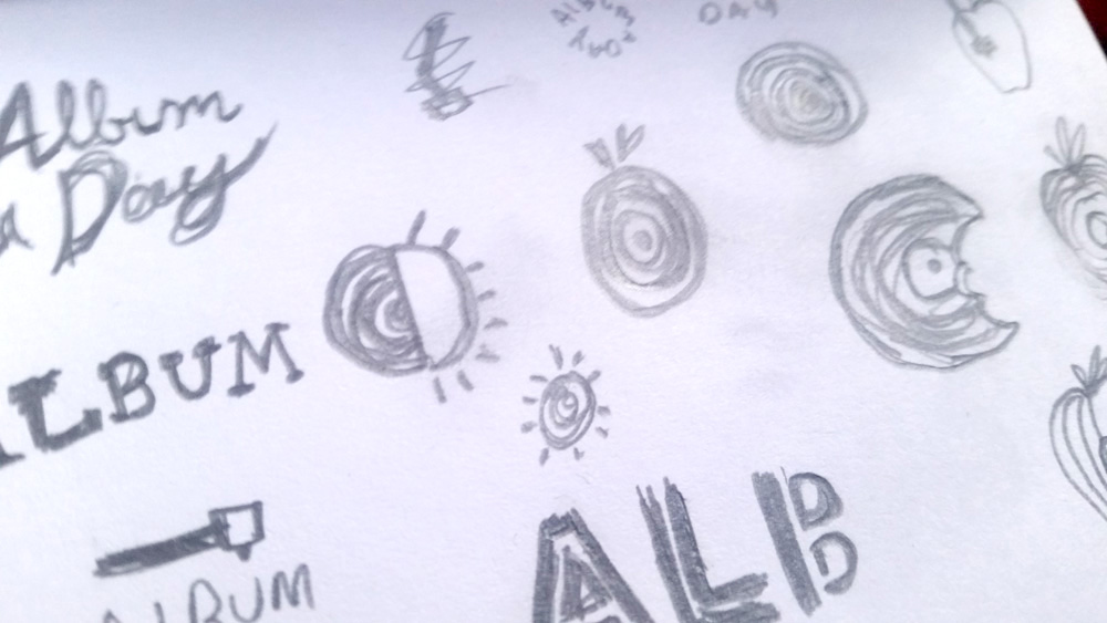
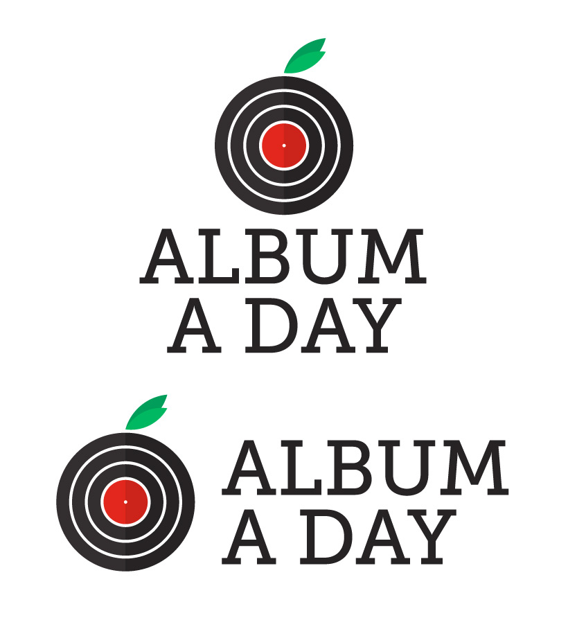
“Album A Day” is a play off of the old adage “an apple a day keeps the doctor away,” so for the logo I decided to represent a vinyl record as an apple to reflect the play on words. Since vinyl records were so much more prevalent decades ago, I went for a sort of 1970’s look to the design, opting for thick, groovy lines, simple shapes and bold colors. I selected Museo Slab as the primary typeface as it shares that classic vibe, while also being superbly neat and clean.
For Album A Day’s website, I wanted to achieve something very minimal. Rather than be bloated with widgets and extras, the site relies on a simple layout of menu and posts. Because it is all about the album of the day, each post has a large featured image, highlighting the album’s cover.
