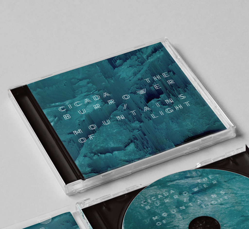


Unlike other album artwork I’ve done, this release posed an immediate challenge in the sense that I didn’t have a title or inherent theme to work with. Instead of going for something too simple and vague, I decided to try to take the idea of the word “split” and make it concrete.
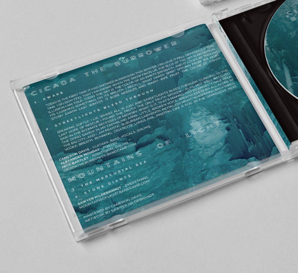
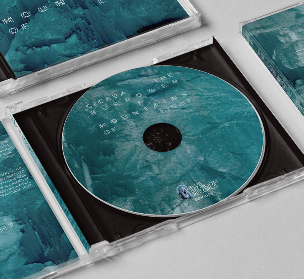
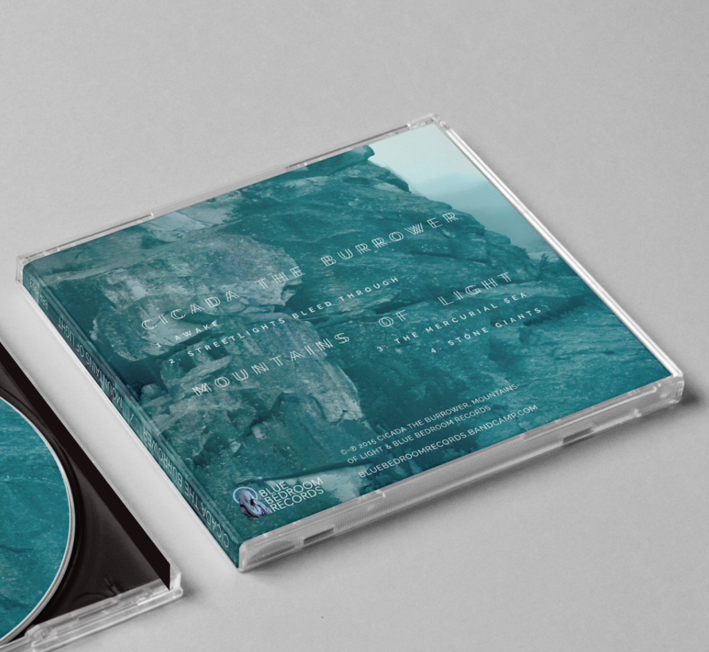
I did this in a few different ways. First, I started with some photos I had taken of a jagged, broken cliff face full of crevices – literal “splits” in rock. I then ran the images through some extreme pixel sorting to give them the feeling like they were being dismantled, torn apart pixel by pixel. And lastly, through staggering the title typography to add to the glitchy, pulled apart aesthetic.
Even with all of the glitched-out destruction, I still wanted to maintain legibility and clarity, so I choose the strong, clean, Raleway as the base for the album’s typography.
